


Lisa Klop, Brand Director of Ace, outlines the thoughtful process behind their vibrant rebranding and how it is geared to reflect their mission of triggering positive change.
Can you introduce us to Ace and the brand’s identity through the years? How were the past brands conceptualized?
ACE is a young brand, founded in 2020. Over the past two years, ACE has been building its own network centered around culture, entrepreneurship, and innovation.
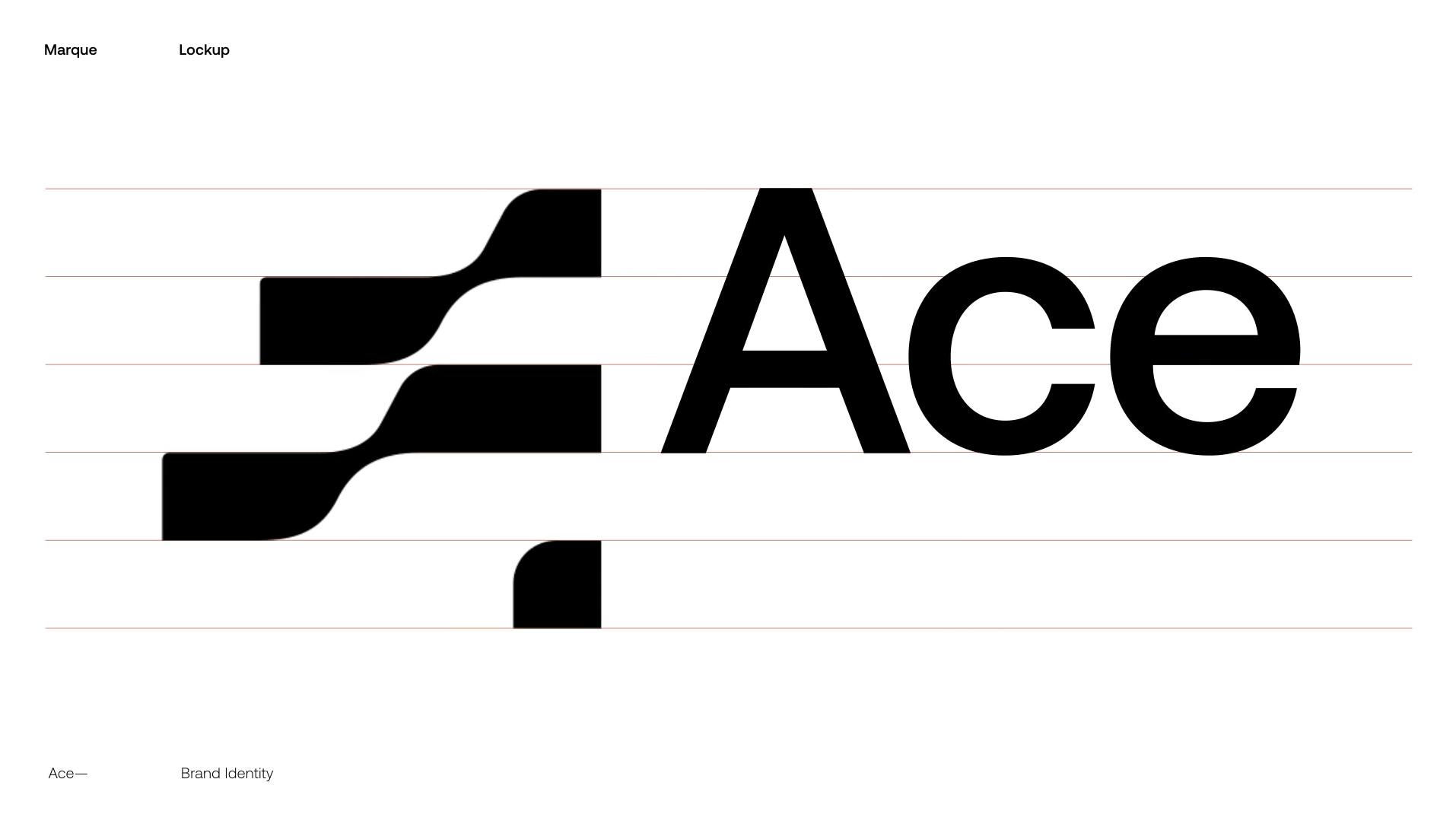
The network consists of a growing group of tech and creative agencies that all retain their own branding, similar to the construct of a record label. This model was translated into the design system, which includes a "+" in the logo, emphasizing the added value of being part of a bigger group with a variety of skills and specializations.
Currently, the network has a total of 12 offices, each with its own specialization, from branding, social media, and public relations to digital, performance, and media.
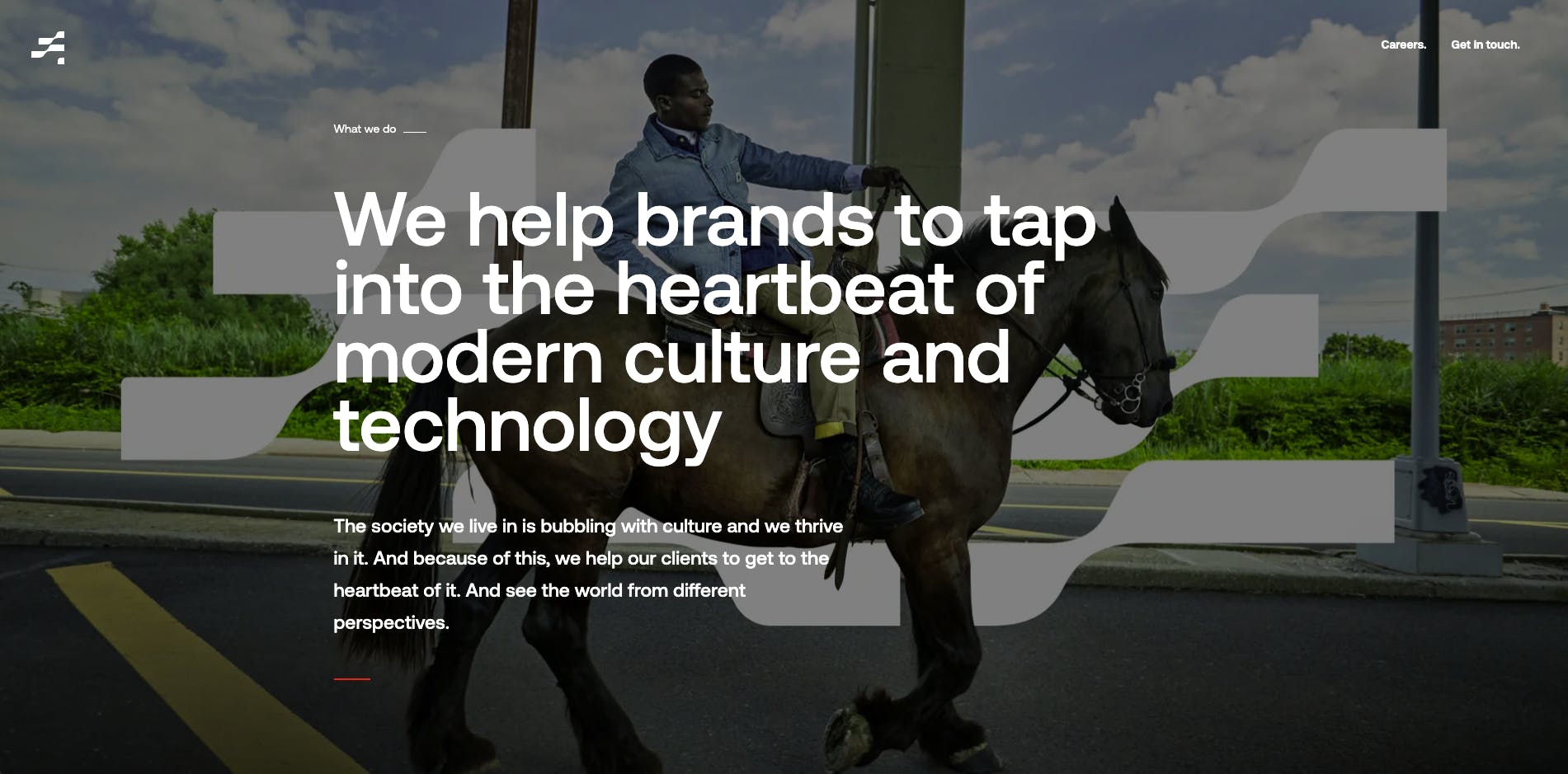
At ACE, all of these disciplines come together under one roof, with the brand promise 'Made for the new world’. By entering the market as an integrated network, ACE became a front door for clients. This approach was translated into a new design system implemented in September 2022 across the new Club ACE office building at the Houthavens in Amsterdam, bringing the network together under one roof.


About this current rebranding, how did it come about? How did that conversation start?
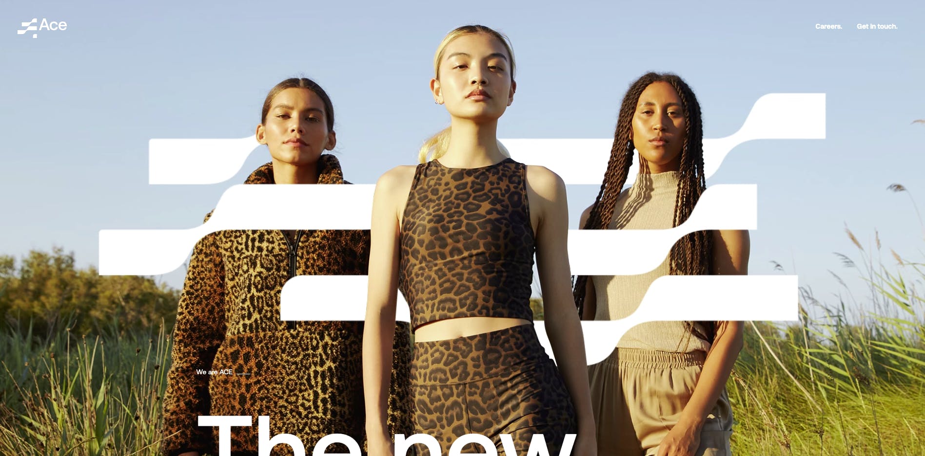
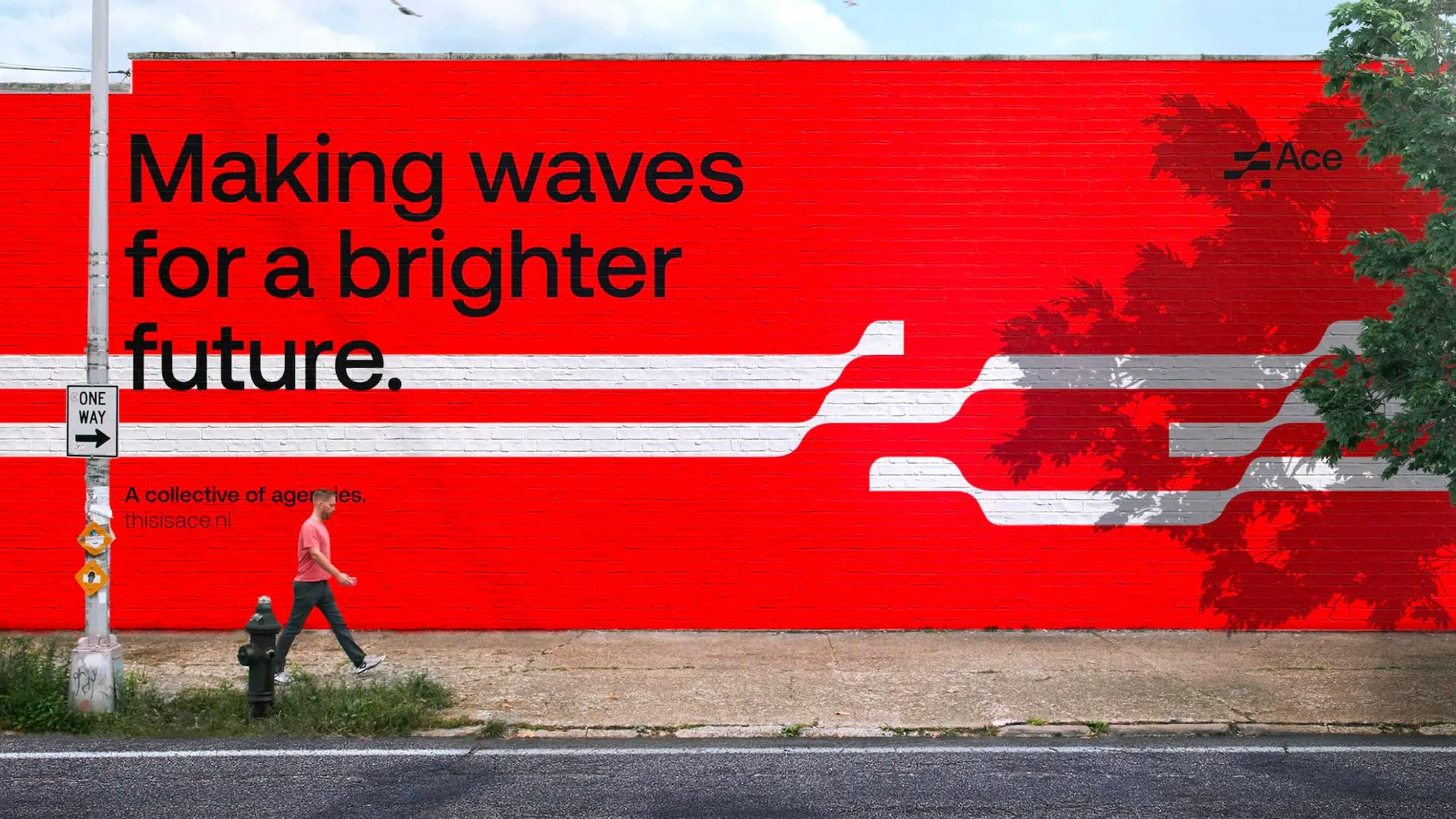
ACE is a family of creative agencies on a mission to trigger positive change for people, brands, and society. The name ACE stands for "Authentic," "Cultural," and "Energizing," and the organization is determined to make waves for a brighter future.
"Making waves" was the foundation for the development of the multi-platform brand identity, which translated the ACE brand from the digital to the physical realm and from static to moving. The result is a lively, modern feel that unifies the ACE family and effectively communicates its mission.
How did the rebranding process go? Was it all smooth, or did you encounter challenges?
It was a collaboration between different creative entities, from creative direction to architecture. Which meant a constant dialogue between the development of the brand identity and the Club ACE office building.
Resulting in an interesting but challenging process, as we translated our new identity into both the digital and physical realms, covering everything from the new Club Ace office to the logotype, icon sets, typography, motion, sound, brand extensions, and more. Ready to make waves for a brighter future.
A big change was to your logo. Can you tell us how it was conceptualized?
Our brand identity video explains everything in great detail.
How about your color palette? How did you land on these colors, and what do they say about your brand?
We landed on the colors: White, Steel, Black, Smoked Oak, Petrol Green and Energizing Red.
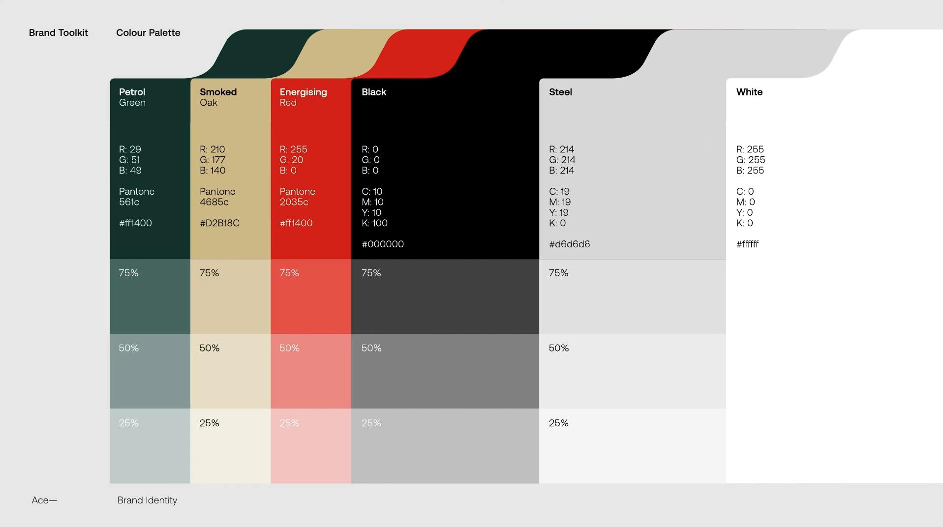
Energizing red is key to the palette, the third Energizing element in ACE, marking the central staircase in the Club ACE collaborative area. The constant dialogue between the digital and physical space got us to land on the remaining colors in the process.
Can you tell us more about the fonts that you use? How were they chosen? Were they custom-made?
We went for the Aeonik font, a timeless font with its own signature as well as a professional look and feel.
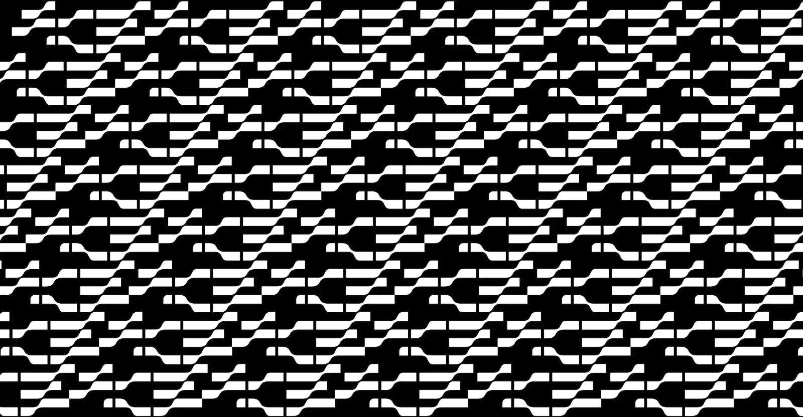
You also have a distinct iconography. Can you tell us how that was developed?
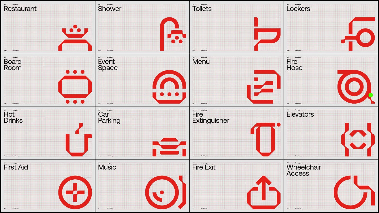
The iconography was derived from the shapes and lines of the logo design. These icons were designed by Gino van Lierop and implemented in the Club ACE office building.
What is your major takeaway from this experience? Or, do you have any advice for brands or designers embarking on rebranding projects themselves?
We developed the physical and digital spaces simultaneously, both the design system and the office space. This made the process interesting and beautifully bridged the two worlds together.
However, it would have been easier if we had more direction on the brand before embarking on the architectural project.
Brand Identity Credits
Rogier Ijzermans: CEO
Sjors van Hoof: Creative Director
Rogier de Bruin: Creative Director/Copywriter
Sander van de Bunt: Program Manager
Smörgåsbord studio: Creative direction
Vincent Venema: Creative Director
Woodwork: Motion design
THNDR: Audio Design
